Offer
Provide additional details about the offer you're running.
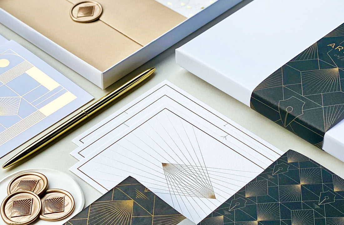
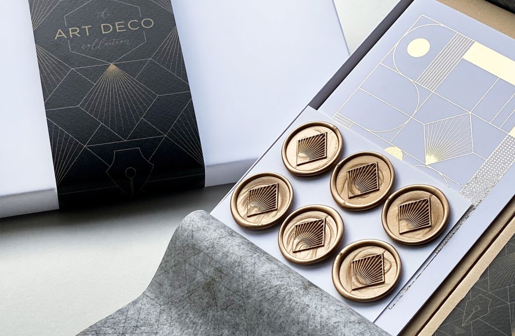
There are certain words that spring to most people’s minds when you ask them to describe the Art Deco movement, ‘sleek’, ‘glamorous’, ‘bold’, ‘elegant’. All of which we wanted to capture in the designs for each component. For each new theme, as mentioned in previous blogs, we have a bit of a product formula in terms of elements needed to turn it into a theme. The first design is always the tissue paper, as more often than not it features a number of illustrations that we then take pieces of to put into the other products; A5 paper, A6 notebook, postcard/prints, greeting cards, and a wax seal. With the envelopes we previously used to do illustrated ones but recently changed to use thick luxury G.F Smith ones and assign a colour to the various themes we have.
Don’t worry I’m not going to go into the full history of Art Deco as even though I have an art background, I am most definitely not an expert on the subject, and there are some really interesting blogs online if you want to learn about the development of it as an art movement. For us we wanted to do it to focus on the simplicity of shapes and geometric lines, but to bring in illustrations directly referencing writing. It was also the first theme purely designed by Gav, now usually little bit of bickering goes on with every theme we do about tiny details, but with this one it was relatively bicker free as I knew it was one he was really keen to do but also to add his style using clean lines and symmetry (plus as you can see below, our cat Mr Miaow kept him in check).
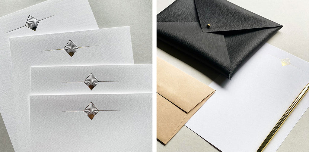
The only thing I really did was to do some little sketches for the motif of the writing paper. In terms of influences we looked at everything from furniture, to architecture and jewellery, to see which designs really stood out to us. For the main pattern we decided to use a classic diamond fan motif, as the pointed shape reminded us of a pen nib; with the fine graduated gold inner lines resembling ink flowing through it.
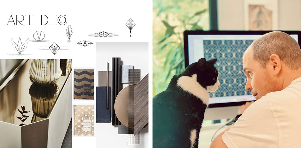
When we design a new theme we have a main colour, and for this we knew it had to be gold. If someone asked you to think of 2 colours associated with Art Deco it’d most likely be black and gold, hence why for the first time we did a 2 colour tissue design as we felt it needed both.
We also knew that again for the first time, we needed to incorporate gold foil to get the perfect shiny opulent gold on the writing paper. To anyone wanting to know the process, there are three foiling methods; hot stamping, cold foiling or digital foiling. For hot stamping, this involves hitting a heated metal block (or ‘die’) onto a foil material that is set against the paper/board. Heat and pressure fuses the foil to the paper surface. Cold foiling is applied using adhesive transferred by a standard printing plate and done in-line as part of the offset print process; there is no need for blocks or stamping but you can only use certain papers as this process applies the foil ‘flat’ and not stamped under pressure. Also, the end result is generally not as vibrant as hot stamping. Digital foiling, like cold foiling, does not require blocks or stamping. The foil fuses to a special toner as part of the digital print process & then a lamination is added on top of it to set it in place.
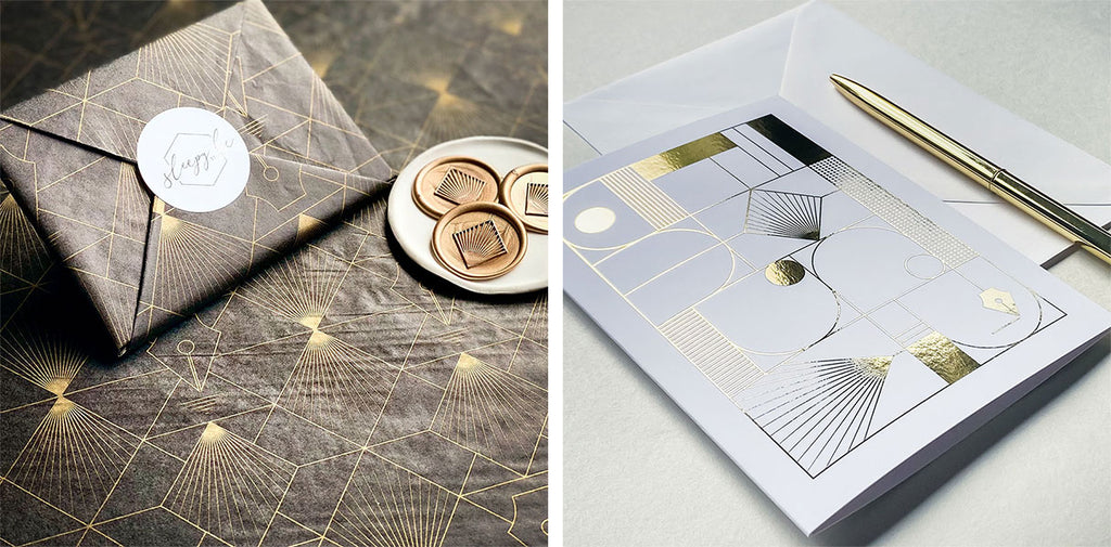
So we used a combination of digital foil for our greeting card as it was on a smooth surface thick card, with a velvet lamination added on top to fix it in place, and hot foil stamping for the writing paper.
Once we had done the designs we then applied them to the various components, and printed out a mock-up of each piece, this is done for every new design to check the scale of the illustrations look correct. Nine times out of ten there will be 2 or 3 design options for certain things so we put them all up on the display wall in the studio and look at them with fresh eyes the morning after printing them to see which one jumps out as the stronger look. After it’s all decided, Gav sets the artwork up ready to be printed and we then wait a week or so for the stock.
When we have all the stock ready, photography takes place (a very, very lengthy process!) and I’m always over the flipping moon when my sister Claire helps me to shoot it, as she’s a professional photographer and so I style it and faff about to a silly degree, and she photographs it. I’d love to say we’re the epitome of professionalism but it’s usually a bit of a comical event with lots of coffee breaks and laughing for an entire day (one day I will do a time-lapse just to prove it to you!) To be honest though it’s so much more fun to do with someone else as product photography on your own is difficult to do and it can drive you a bit nuts after a while dealing with the set up and then the lighting etc.
Web set up is the next stage, I may have said it before but I honestly have so much respect for copywriters as trust me it’s seriously difficult work to come up with a lot of informative yet engaging text for every product. I’m most definitely guilty of doing the cardinal sin of duplicating copy as it’s not good for the SEO side of things, but when you’ve got multiple products to launch and time is of the essence and your brain has finally had enough of it, you do sometimes have to give in.

So finally comes the launch! It’s always lovely hearing the feedback from people as to whether they buy the products as a gift for a stationery addict they know, or if they buy it for themselves as they’ve just taken up writing letters to friends rather than sending emails. As ever our aim is to design and create something that’s high quality and special to the person receiving it. A very big thank you to you for taking the time to read this, and if you have any questions on the products or process I’d be more than happy to help.
